drilling an oil well, virtually!
Transforming complex, decades-old legacy software into an intuitive platform that halved task times and mitigated multi-million dollar risks
00

problem
In the oil and gas industry, a single second spent drilling on a rig costs roughly ₹900 (amounting to ₹7 crores a day). A failure or unplanned event doesn't just cause massive monetary damage; it can lead to severe environmental catastrophes. Drilling engineers rely on specialized simulation software to predict dynamics and mitigate these risks. However, the existing simulation tools were decades old, with UI shaped by accretion rather than usability, and understood by only a handful of veterans. Training new engineers was a massive, time-consuming challenge. The core question became: "How do you redesign and enhance a product built by engineers, for engineers, without losing technical depth?"
solution
Operating within a globally distributed Agile environment (spanning North America, Europe, the Middle East, and India), I collaborated with subject matter experts, product owners, software engineers, and technical architects. Joining after the MVP phase, my primary objective was to establish a scalable design workflow and drive the continuous improvement of the platform. I served as the bridge between highly technical user needs and an intuitive user experience. On any given day, I facilitated cocreation exercises with SMEs, presented design proposals to stakeholders, and sat side-by-side with developers and QA to iron out complex interactions while ensuring alignment with the broader business goals.
When I joined the team, they already had an MVP and had identified a platform within the organization on which they could build the next-generation drilling engineering tool. I spent a couple of weeks with the SMEs and designers who worked on the MVP to learn about the domain and the work that had been done so far. My predecessors had conducted several rounds of in-person user interviews and had derived personas to help drive future conversations.
My first task was to establish a design workflow that could work for Agile. Our team followed a quarterly release cycle. So, we prioritized and defined features from the project roadmap for each quarter using a "value vs. complexity" prioritization model. Once prioritized, it would then be up to the designer and SMEs to figure out how they wanted to flesh out the details. Some features required discovery workshops with several SMEs, while others needed just a few one-on-one calls.
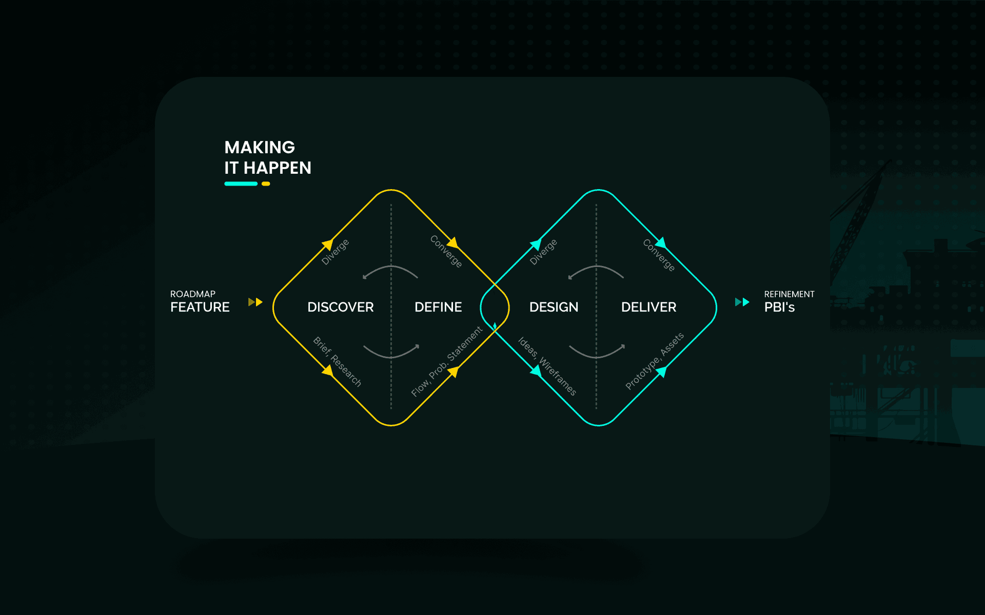
discover
Once an initial feature flier is drafted outlining the purpose of a particular feature, we set up a series of meetings. We discuss how our engineers are doing it now, set up walk-through demos, and, if possible, get an idea of how our competitors enable their engineers for this task. To get opinions and hear from our wider user base, we create and send surveys using an in-house tool. This is quite helpful when SMEs have contradictory views. The SMEs are users themselves, but every now and then, they have polarized opinions. It is a good indicator of when to dig a bit deeper.
define
The identified scenarios (happy paths, extremities) and findings from the discovery phase are usually presented to stakeholders using a deck, or a virtual whiteboard if the meeting needs to be interactive. We often use card sorting exercises with stakeholders when we aren't sure where a particular functionality belongs. The ensuing discussions in these meetings help identify opportunities and synthesize problem statements (e.g., How might we make this less error-prone? Faster? More intuitive?).
design
Once the team agrees on an approach, proposals are created. Based on the nature and number of ideas, we use either low-fidelity wireframes illustrating potential paths with blocky screen designs, or high-fidelity mockups created using Axure or Figma. If a particular feature is quite technical or ideas are hard to come by, we rely on co-creation sessions with SMEs or designers from the product line.
The ideas are presented to stakeholders to garner feedback, and they are refined and narrowed down until a consensus is established among all stakeholders. To quickly illustrate ideas during workshops, we use a purpose-built component library and rely on the framework's design system. Since the software is built on an existing framework, the components are already available, and high-fidelity designs are required only for unique cases.
deliver
For the finalized design, wireframes with interaction notes and annotations are published, and a link is attached to the feature (we use TFS). Assets like icons and specifications (for new components and colors) are also attached here. The team then refines and breaks down the feature to do effort estimation. I make time to be a part of this process, since developers might have concerns regarding the proposed design which might require me to take a step back and revise it.
My engineering background often comes in handy when developers push back on design proposals, and we work together to find a solution. We have set up the dev workflow to make sure that UI-related PBIs are marked as "done" only after the designer is given a preview. This step ensures that the developed experience matches what was envisioned by stakeholders, and any irregularities can be ironed out before sprint demos. Anything that is missed is captured as a bug or an enhancement.
feedback loops
After hitting specific milestones (e.g., after an important release), usability testing sessions are set up. Due to the nature of the software, we prefer moderated usability studies. Although remote sessions are easier to organize, we prefer in-person tests to catch the nuances you would otherwise miss in a remote session.
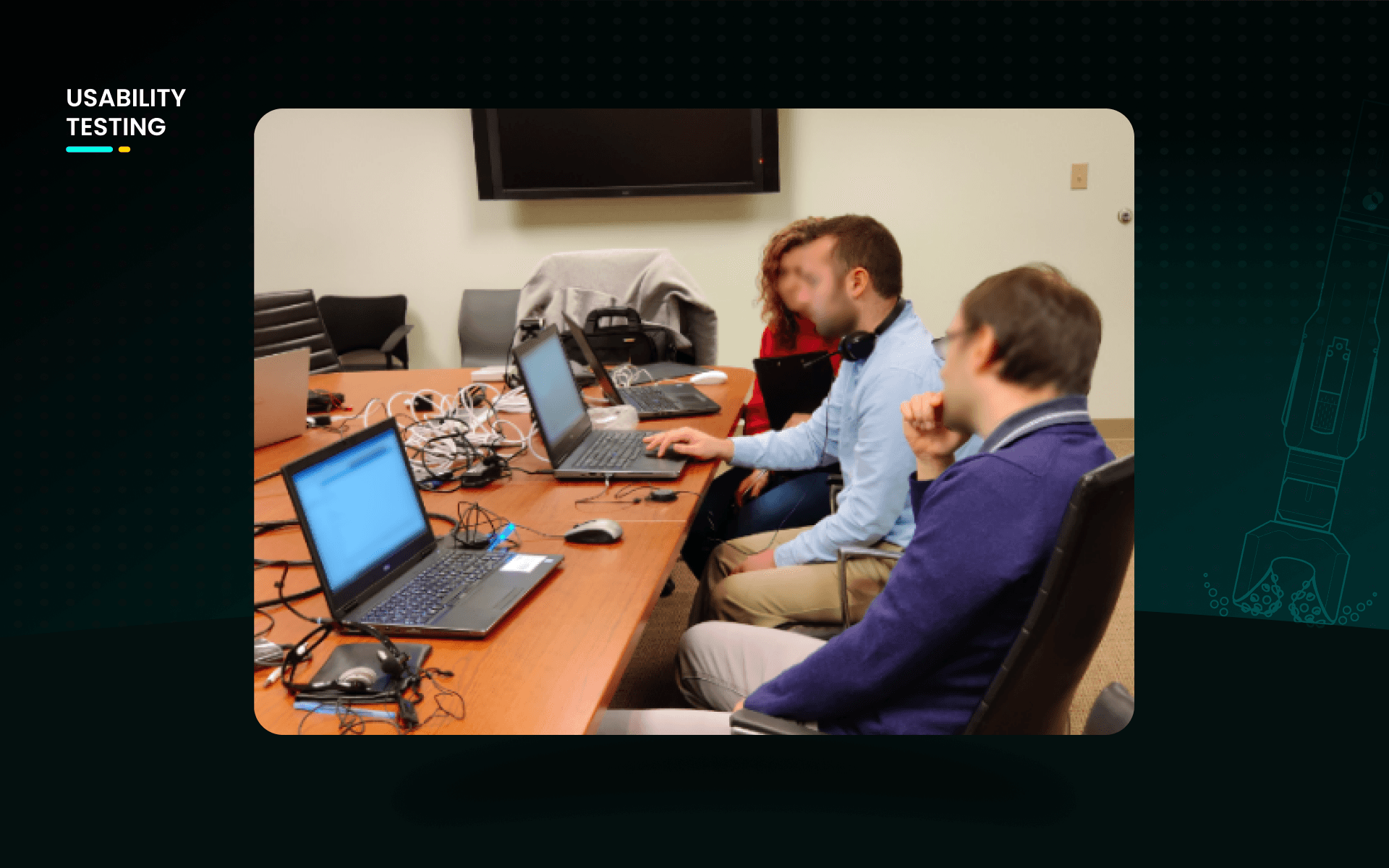
We use "user profiles" to identify test participants. For example, we wanted engineers who were not part of any drilling engineering research or training process for a test of intuitiveness. We sent out a screener survey to our engineers and used the responses and user profiles to identify users who fit that description. We brief participants in advance and instruct them to bring their own laptops. This reduces the chances of any false flags due to them being in an unfamiliar environment. Since we record the sessions for further analysis, we hand out consent forms before the session.
The testing team always has an SME who can clarify technical questions and two designers to take turns as moderator and observer. To standardize the test, we always use a testing script. We model tasks based on the test goals. For example, to test how easy it is for a legacy software user to adapt to the new software, we asked them to build a case from scratch with zero training. We usually end the sessions with a short questionnaire about the software to get general feedback.
"Since participants are internal, we try to join them for lunch and use the opportunity to talk about their work and get a better understanding of our users."
We score task progress using a customized Excel sheet (completed, required help, failed). Once ready, we present the results to stakeholders with the findings and an "experience video" highlighting key moments. The first video we ever put together from recordings was of happy users complimenting the software. It was a hit within the department and made it into the PO's presentations to management. The findings are then prioritized and captured as actionable items in the product backlog.
year
2018
timeframe
2 Years
tools
Axure, Figma, Azure, VS
category
Enterprise Software
impact
Reduction in Task Failure Rate
17%
Reduction in Time on Task
42%
A primary business goal was to drastically reduce the time and money spent on mandatory annual software training for engineers. By utilizing familiar concepts to reduce the relearning curve and integrating clear documentation within the UI, the redesign was a resounding success. Usability tests proved that our engineers could perform complex tasks much more efficiently. We successfully halved the time required to complete core tasks, and untrained users were able to navigate the platform and complete scenarios with a significantly lower failure rate, often without ever needing to access the built-in help features.
learnings
The Designer as a Facilitator: I learned that a designer's role often shifts to coordinating discussions for the greater good. By empathizing with different perspectives, designers can unite cross-functional teams that might otherwise remain siloed. Navigating Framework Constraints: Being tied to a rigid enterprise framework means the "ideal" UX idea sometimes has to take a back seat to technical feasibility. I learned to pick my battles wisely and secure buy-in only for the most critical user interactions. Developer Relationships Pay Off: Maintaining strong ties with the dev team is crucial. Because of our great relationship, my devs built me a "hidden tool" in the dev environment to tweak chart visualizations on the fly, saving me countless hours of recreating complex data visualizations in Figma.
01

02

see also


